
Celery Is Having a Moment, and I Think It's About Time
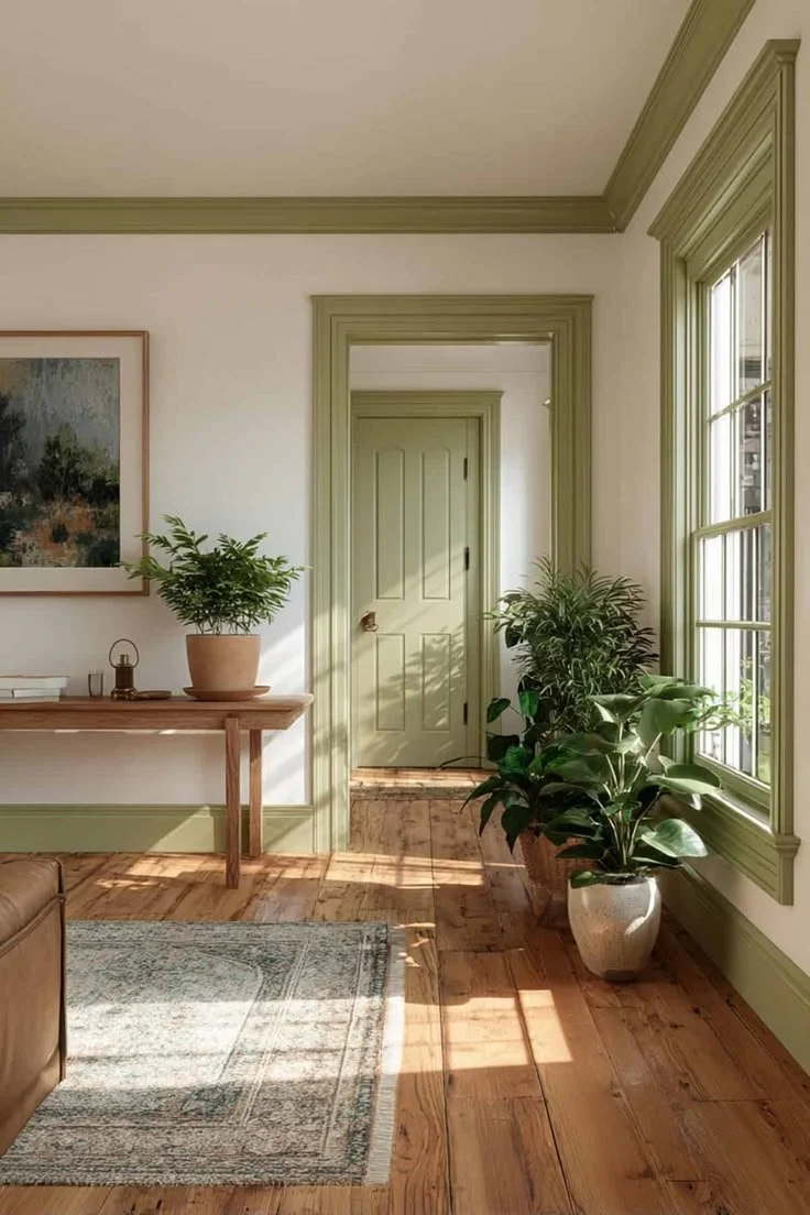
Sherwin-Williams just named their 2027 Color of the Year, and honestly, I think they got it exactly right.
When I first saw Celery SW 6421 announced as the color of the year, my reaction was immediate and it was yes. Not the polite, considered yes of a designer who appreciates a trend from a distance. A genuine, I-have-been-waiting-for-this yes.
Here's what makes it interesting: Celery is technically a green, but it doesn't behave like one. For starters, it's soft, warm, and muted enough to read almost as a neutral in the right light, which means it has an unusually wide range of applications and it can quietly support everything else in the room without demanding attention. But, it can hold its own as a statement, too. That kind of flexibility is rare in a color, and it's exactly why I think this one has real staying power.
What Celery Actually Looks Like
Think of the color of a celery stalk in good natural light, but softer. A light yellow-green with enough warmth in its undertones that it never tips into cool or clinical territory. It shifts beautifully throughout the day, reading a little brighter and more energetic in morning sun and settling into something quieter and more grounded in the evening. If you've been looking for a color that lives somewhere between green and a warm white, this is it.
How to Pair It
The combinations are where this color really opens up.
For something grounded and serene, pair Celery with warm browns, rich taupes, and creamy whites. Think linen, aged wood, unlacquered brass. This approach lets the color do its neutral work while the warmer tones around it keep everything feeling organic and lived-in rather than cool and curated.
For something with a little more personality, try it against periwinkle or rhubarb. These pairings have an energy to them that feels current without being trendy, the kind of combination that surprises you in the best possible way and still manages to feel completely intentional.
Where to Use It
On the walls. The obvious answer, and a great one. Celery on the walls of a living room or bedroom brings in a quality of light that's hard to describe and easy to feel. It's the color equivalent of a deep breath.
On cabinets. This is where I get especially excited. A powder bathroom or a kids' bathroom with Celery cabinetry would be genuinely joyful, which is exactly what those spaces should be. It's distinctive without being jarring, and it has the warmth to age gracefully rather than feel like a moment you'll want to paint over in three years.
On outdoor upholstery. An underrated application, and one I love. Celery outdoors, against natural wood decking or stone pavers and the actual green of a yard or garden, is a color conversation that feels completely at home in the Pacific Northwest landscape.
In fabric and upholstery. An accent chair in a pattern that carries Celery, or a set of pillows that pull it in as a supporting tone rather than the lead, is a lower-commitment way to bring this color into a space you're not ready to paint. It's a particularly good approach in a room that already has warm wood tones or natural textures looking for something to play against.
Why I Think This One Matters
Color of the year announcements can feel like a lot of noise. But every so often one lands that actually reflects something real about where design is heading, and I think Celery is one of those. It fits naturally into the move toward earthy, grounded palettes that have been building for the last few years, and it brings something those deeper tones sometimes lack: lightness. It makes a room feel alive without making it feel loud.
If you've been on the fence about bringing more color into your home, Celery is a beautiful place to start.
